A well-formatted CV improves readability, helps recruiters quickly identify key information, and increases your chances of passing Applicant Tracking Systems (ATS).
You may have the right qualifications, relevant experience, and impressive achievements, but if your CV is poorly formatted, recruiters may never discover them.
Many job seekers focus heavily on what they write while completely overlooking how their CV looks and functions.
Formatting isn't just about aesthetics.
A well-formatted CV improves readability, helps recruiters quickly identify key information, and increases your chances of passing Applicant Tracking Systems (ATS).
On the other hand, poor formatting can make even the strongest candidate appear unprofessional.
In this guide, we'll examine the most common CV formatting mistakes and show you exactly how to fix them.
Why CV Formatting Matters
Recruiters often spend less than 10 seconds reviewing a CV during the initial screening process.
During those few seconds, they are looking for:
Relevant experience
Key skills
Education
Achievements
Career progression
If your formatting makes these details difficult to find, recruiters may move on to the next candidate.
Good formatting helps your CV:
Look professional
Improve readability
Pass ATS screening
Highlight important achievements
Create a positive first impression
Think of formatting as the packaging of your professional story.
Even great products struggle when packaged poorly.
Mistake #1: Using Multiple Fonts
One of the fastest ways to make a CV look unprofessional is using several different fonts.
Some candidates use one font for headings, another for body text, and yet another for contact information.
The result looks inconsistent and distracting.
Bad Example
Arial for headings
Times New Roman for experience
Calibri for education
Fix
Use one professional font throughout the document.
Recommended fonts:
Calibri
Arial
Aptos
Helvetica
Verdana
Consistency creates a cleaner and more professional appearance.
Mistake #2: Using Fonts That Are Too Small
Trying to squeeze more information onto a page often leads candidates to reduce font size.
This creates readability problems.
Recruiters should never struggle to read your CV.
Bad Example
Body text at 8pt or 9pt.
Fix
Use:
10pt–12pt for body text
12pt–16pt for headings
Your CV should remain easy to read both on-screen and in print.
Mistake #3: Overcrowding the Page
Many candidates try to include every job, achievement, skill, and responsibility they've ever had.
The result is a dense wall of text.
Recruiters don't read walls of text.
They scan.
Signs of Overcrowding
Tiny margins
Long paragraphs
No white space
Excessive bullet points
Fix
Create breathing room.
Use:
Clear section breaks
Adequate spacing
Short bullet points
Reasonable margins
A clean layout immediately improves readability.
Mistake #4: Writing Long Paragraphs
Your CV is not a biography.
Recruiters prefer concise information they can scan quickly.
Bad Example
A six-line paragraph describing a previous role.
Fix
Use bullet points instead.
Example:
❌ Managed customer support operations while overseeing complaints, responding to customer concerns, training new staff, and monitoring service performance.
✅ Managed customer support operations for 5,000+ customers.
✅ Trained and onboarded 15 new support representatives.
✅ Improved customer satisfaction ratings by 18%.
The second format is easier to read and more impactful.
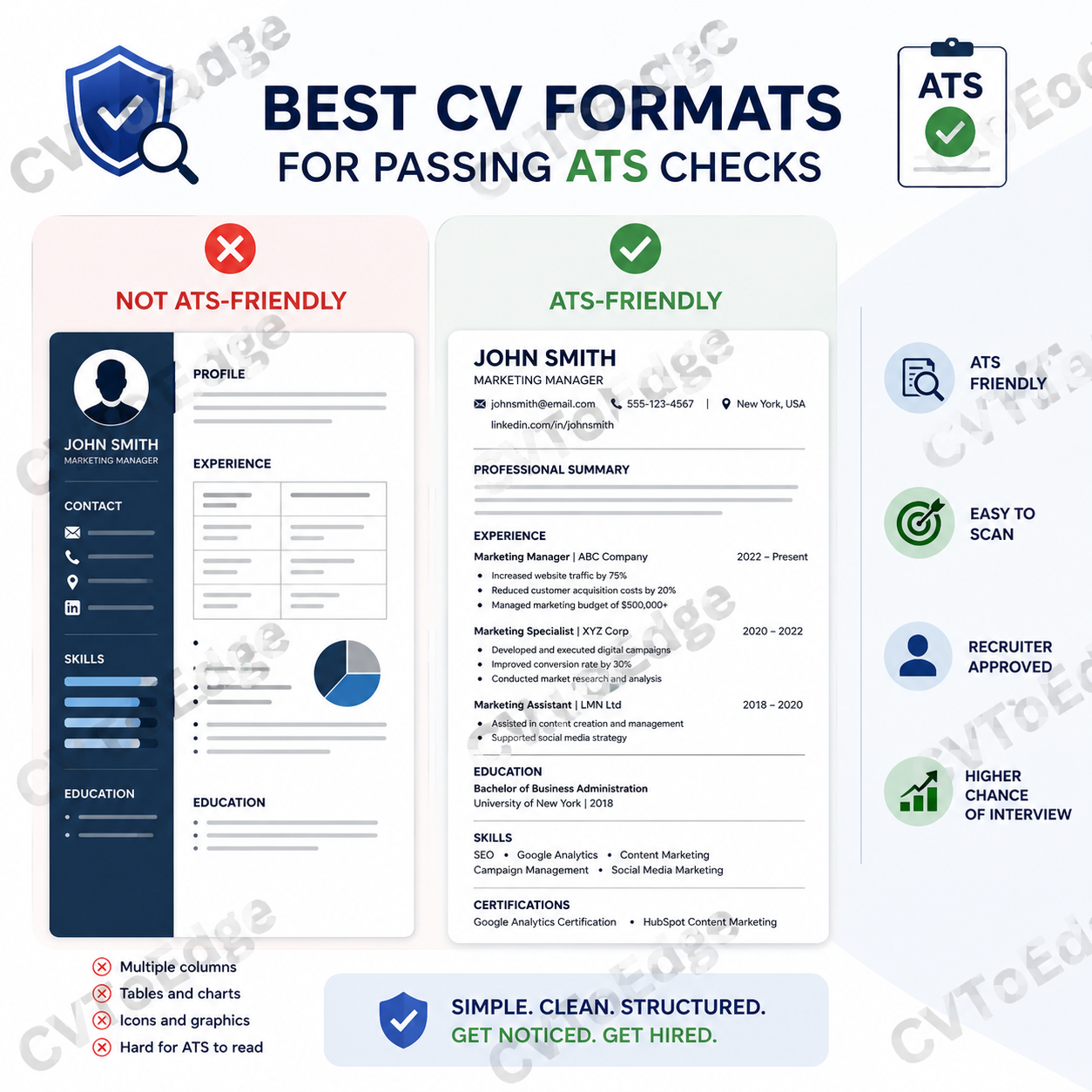
Mistake #5: Using Tables and Complex Layouts
Many modern CV templates look attractive but create problems for ATS systems.
Tables, columns, graphics, and text boxes can confuse applicant tracking software.
Common Problem Elements
Multi-column layouts
Tables
Charts
Progress bars
Text boxes
Graphic-heavy designs
Fix
Use a simple, ATS-friendly structure:
Contact Information
Professional Summary
Experience
Education
Skills
Certifications
Simple layouts consistently perform better.
Mistake #6: Inconsistent Formatting
Inconsistency signals a lack of attention to detail.
Examples include:
Different bullet styles
Uneven spacing
Mixed date formats
Random text sizes
Bad Example
2024 - Present
March 2023 to January 2024
01/2022 – 02/2023
Three different date formats on one CV.
Fix
Choose one format and use it throughout.
Example:
Jan 2024 – Present
Mar 2023 – Jan 2024
Feb 2022 – Feb 2023
Consistency creates professionalism.
Mistake #7: Poor Section Organization
Recruiters should immediately know where to find important information.
A disorganized CV forces them to hunt for details.
Common Problems
Skills buried at the bottom
Education mixed into experience
Missing section headings
Fix
Follow a logical structure:
Contact Information
Professional Summary
Work Experience
Education
Skills
Certifications
Additional Information
This structure is familiar to recruiters and ATS systems.
Mistake #8: Using Too Many Colors
A CV is a professional document, not a marketing brochure.
Excessive colors can appear distracting and unprofessional.
Bad Example
Red headings
Blue body text
Green icons
Yellow highlights
Fix
Stick to:
Black
Dark gray
Dark blue (optional for headings)
A clean, professional color palette works best.
Mistake #9: Including Photos When Unnecessary
Many job seekers add photographs because they believe it makes their CV more personal.
In many countries, recruiters actually prefer CVs without photos.
Photos can:
Consume valuable space
Distract from qualifications
Create potential bias concerns
Fix
Only include a photograph if:
It is standard practice in your country.
The employer specifically requests it.
Otherwise, leave it out.
Mistake #10: Poor Alignment
Alignment issues immediately make a CV appear sloppy.
Examples include:
Uneven margins
Misaligned dates
Inconsistent indentation
Crooked section headings
Fix
Before submitting your CV:
Review spacing carefully.
Check alignment on every page.
Ensure bullet points line up correctly.
Verify section headings are consistent.
Small details matter.
Mistake #11: Using Generic File Names
Formatting doesn't stop with the document itself.
The file name also matters.
Bad Examples
CV_Final.pdf
Resume_New.docx
MyCVLatestVersion.pdf
Better Examples
John_Smith_CV.pdf
Sarah_Jones_Marketing_Manager_CV.pdf
A professional file name creates a stronger impression.
Mistake #12: Saving in the Wrong Format
Some candidates submit:
Editable Word files
Image files
Unsupported formats
This can create compatibility issues.
Fix
Whenever possible, save your CV as:
Benefits:
Preserves formatting
Works across devices
Looks professional
Reduces accidental changes
Quick CV Formatting Checklist
Before submitting your CV, ask yourself:
✓ Is the font professional and consistent?
✓ Is the text easy to read?
✓ Are there clear section headings?
✓ Is there enough white space?
✓ Are dates formatted consistently?
✓ Is the layout ATS-friendly?
✓ Are bullet points concise?
✓ Is the file saved as a PDF?
✓ Does the CV look professional at first glance?
If you can answer "yes" to all these questions, your formatting is likely in good shape.
Final Thoughts
Many candidates lose opportunities not because they lack qualifications, but because their CV creates unnecessary friction for recruiters.
The good news is that formatting mistakes are among the easiest problems to fix.
A clean, professional, ATS-friendly CV immediately improves readability, enhances your credibility, and increases your chances of getting shortlisted.
Remember: recruiters should spend their time evaluating your qualifications—not trying to figure out where to find them.
If you're unsure whether your CV formatting is helping or hurting your job search, CVToEdge can analyze your CV, identify formatting issues, highlight ATS concerns, and provide actionable recommendations to improve your chances of landing interviews. Register & Subscribe today.